
Responsive View Components
I used to write my iOS views to be pixel perfect, until I discovered UIKit's Preferred Font method and how it worked. After that, I struggled to implement views that were useful at scale, or even beautiful on smaller screens like that of the iPhone 8. Eventually I designed a UIKit component that accounted for accessible font sizes. In this article we'll remake that component in SwiftUI.
The Problem
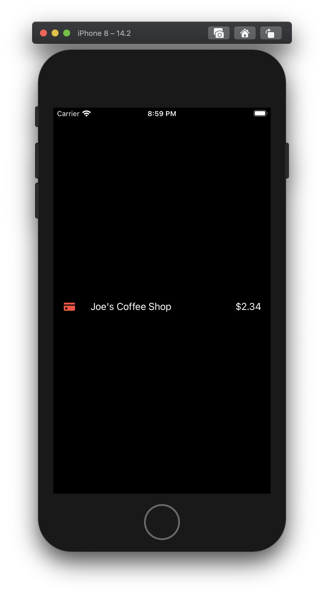
We have a layout that works perfectly in a SwiftUI HStack. This view contains one Image and two Text views. Looks great right?
Well...
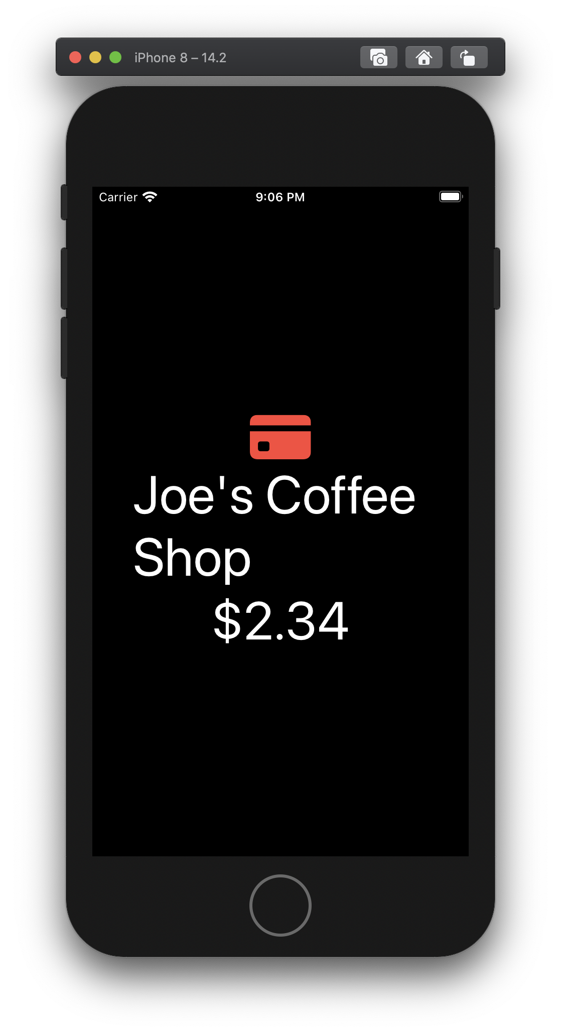
Let's look at it after bumping our preferred font size.
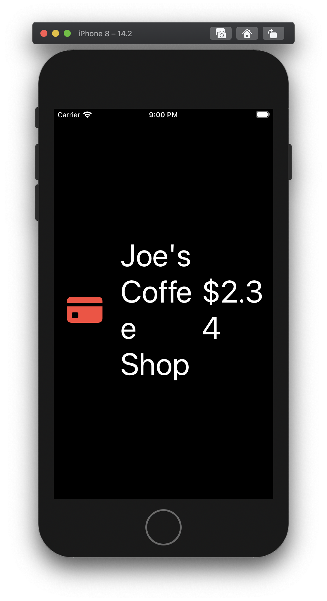
Nope!
That looks like garbage. We need to respond to the font size increase, and change the layout of this component.
Good news is, the SwiftUI team has given us easy access to the user's preferred font size.
Responsive Stack View
For this tutorial, we'll focus on a simple view that responds to accessible font sizes. To do that we'll use the DynamicTypeSize Environment variable in SwiftUI.
On it, there is a computed property, isAccessibilitySize, that returns what we're looking for. If the user has selected to use large fonts and has scaled their font up into the larger fonts category, isAccessibilitySize returns true.
We can add use it like this:
public struct SomeView : View {
    @Environment(\.dynamicTypeSize) public var dynamicTypeSize: DynamicTypeSize

    public var body: some View {
        if dynamicTypeSize.isAccessibilitySize {
            Text("isAccessibilitySize == true")
        } else {
            Text("isAccessibilitySize == false")
        }
    }
}
That's great! But how do I pass in the content I want?
To make our own stack view we'll need to be able to pass in a bunch of subviews. We can do this with a ViewBuilder.
A ViewBuilder is a property wrapper that allows us to pass one or more views into our stack view as a function.
Alright! Let's put the Responsive Stack View together using the DynamicTypeSize and a ViewBuilder!
struct RStack<Content: View> : View {
    @Environment(\.dynamicTypeSize) var dynamicTypeSize: DynamicTypeSize

    let content: () -> Content

    init(@ViewBuilder content: @escaping () -> Content) {
        self.content = content
    }

    var body: some View {
        if dynamicTypeSize.isAccessibilitySize {
            VStack { content() }
        } else {
            HStack { content() }
        }
    }
}
Let's see what it looks like!
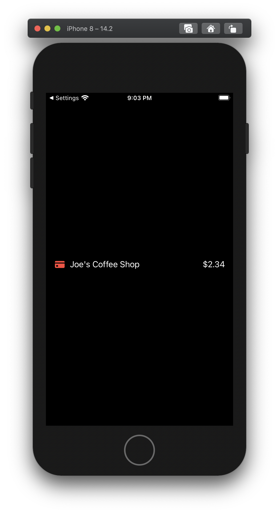
Notice how the RStack has the same syntax of the HStack and VStack? That's the ViewBuilder doing it's magic.
let debitCardImageName = "creditcard.fill" // #DebtIsDumb

struct ContentView: View {
    var body: some View {
        RStack {
            Image(systemName: debitCardImageName)
                .foregroundColor(.red)
                .padding(.trailing)

            Text("Joe's Coffee Shop")
            Spacer()
            Text("$2.34")
        }.padding()
    }
}
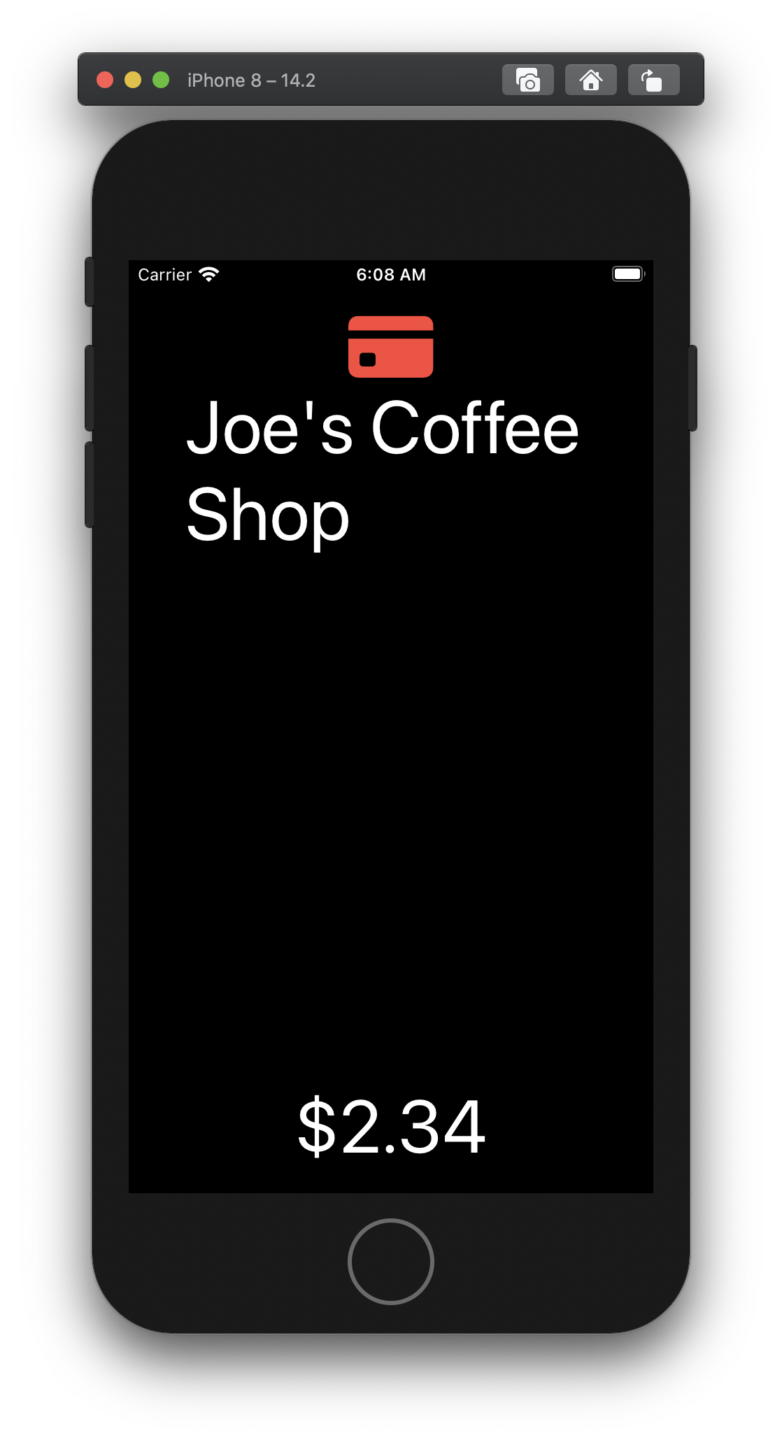
Much Better!
We're getting closer! Although, that spacer is a bit of a problem...
Let's make another component to handle that little detail. After all, practice makes permanent.
For this component, we want to make sure we add a spacer for a horizontal layout, but not a vertical layout. We won't need to use a ViewBuilder because we are only going to be working with 2 Text views.
Let's do it!
Practice makes permanent
struct RDualText: View {
    @Environment(\.dynamicTypeSize) var dynamicTypeSize: DynamicTypeSize

    var firstText: Text
    var secondText: Text
    var spacer = Spacer()

    init(firstText: Text, secondText: Text) {
        self.firstText = firstText
        self.secondText = secondText
    }

    var body: some View {
        RStack {
            self.firstText
            if !dynamicTypeSize.isAccessibilitySize {
                spacer
            }
            self.secondText
        }
    }
}
Putting it all together
Alright, let's go back to our content view, and use our new component.
struct ContentView: View {
    var body: some View {
        RStack {
            Image(systemName: debitCardImageName)
                .foregroundColor(.red)
            RDualText(
                firstText: Text("Joe's Coffee Shop"),
                secondText: Text("$2.34")
            )
        }.padding()
    }
}
Accessible apps don't have to be ugly.
Good work! You've learned how to create a ViewBuilder, and respond to a user's preferred font size! Making a component that accounts for a user's accessibility settings was far more difficult in the world of UIKit. But we've only scratched the surface, there is a lot more to handling accessibility well than what we covered here. There are settings for color blindness, preferring bold fonts, reducing motions and more. And that is just the visual side of accessibility!
Homework
If you'd like to learn more, I have a challenge for you!
Take the RStack component and modify it to take a threshold. If the selected font size is greater than the threshold then the RStack flips from horizontal to vertical. When you instantiate your RStack, it should look like this:
RStack(threshold: .accessibilityMedium) {
    Text("Top")
    Spacer()
    Text("Bottom")
}